 Another little surprise popped up in NetNewsWire today while trying to fix a problem. Something borked my layout and setting it back was not very intuitive. As I’ve mentioned before in a previous post, NetNewsWire could be more user-friendly with its features. Feature-rich it is, but some engineering foresight could make it sing a little prettier.
This time it’s for those fortunate enough to have a widescreen. Always looking for ways to declutterize my life, I try to find solutions to make best use of the space around me. This includes my frequented physical space such as desk and office area, but as a UI designer, maximizing my computer’s screen real estate is part and parcel to the job. Unfortunately for me, I’m much better at the latter, but for you, someone looking to squeak a little more user-friendliness out of your feed-reading experience, I can impart this tip to help you make better use of that additional lateral screen space.
When It’s A Bad Time for the Horizontal-Split Screen
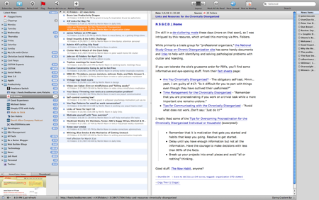
Many programs work in a three-pane layout where there is a side bar with a horizontal split-view next to it.
Example:
Now in a widescreen scenario, these layouts don’t always make sense. Especially when you have two levels of vertical lists that control a vertical content area. That’s three vertical regions and so a horizontal split has no real business being there when you can expand out laterally. (Think Mail.app)
NetNewsWire is an exemplary app for this scenario and here are three ways to get into “Widescreen Layout”:
- Cmd-2
- From the Menu Bar under View > Layout > “Widescreen Layout”
- Customizing the toolbar by adding the “Layout” module
Customize Layouts with the Toolbar Module
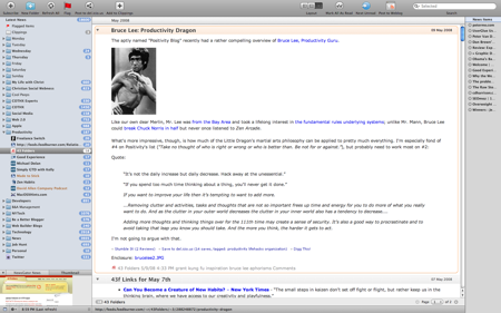
The third approach was the little surprise. After poking around the menu bar, I couldn’t find what I was looking for easily so I checked the contextual menu from the toolbar area; that is, right click or ctrl-click in the top area of the main NNW window. Then just drag-and-drop the layout module from array of custom options. (It’s awesome that customizing applications can be this easy.) ![]()
Some may argue that making this module visible would not be the best option because the need to change the layout is likely a fringe case. However, there is plenty of horizontal space and actually, I’ve found that switching between two of three layouts may be useful for some research writers.
Three-Panes – Ideal for Scanning Feed Collections or Many Entries
The middle option, 3-panes, is good for scanning high-level collections (folders, custom searches, smart lists, etc.) where there could be hundreds of headings. Scrolling and scanning then selecting an item would take place in the middle pane. The item would then open in the right-hand pane leaving the middle pane open for further scanning.
Two-Panes – Ideal for Scanning Entries in Single Feed
The third option, 2-panes, is good for starting on a specific feed then scanning its entries. I probably won’t make much use of the first option (horizontal split) on a widescreen monitor, but for a standard monitor –or if I connect to an external, standard monitor–that layout would be appropriate.
Isn’t Having a 100+ Feeds a Bit Much?
From a bit literacy perspective, having this many feeds may be an overload, but I’m thinking about research writers; that is, people who would most benefit from an app like NNW. The Layout Switcher is an advanced feature, but worth using when you need to browse through mad amounts of subscriptions frequently.
Incidentally, many Macs these days are widescreen so the experience designers at Newsgator Technologies may want to take that extra step in detecting resolution and setting a default accordingly. It’s an advanced feature, for advanced users, but is certainly a time-saver no doubt.
Hope tip helps out!
Linkage
- In case you’re not using NetNewsWire and want to check it out: NetNewsWire Free Download – NewsGator Technologies